Product Tours
Step-by-step guided walkthroughs that highlight features and explain workflows.
A tour walks users through a feature one step at a time. Each step highlights an element on the page with a popover — title, description, and optional image. Users navigate forward and back, and Callout remembers where they left off.
Creating a Tour
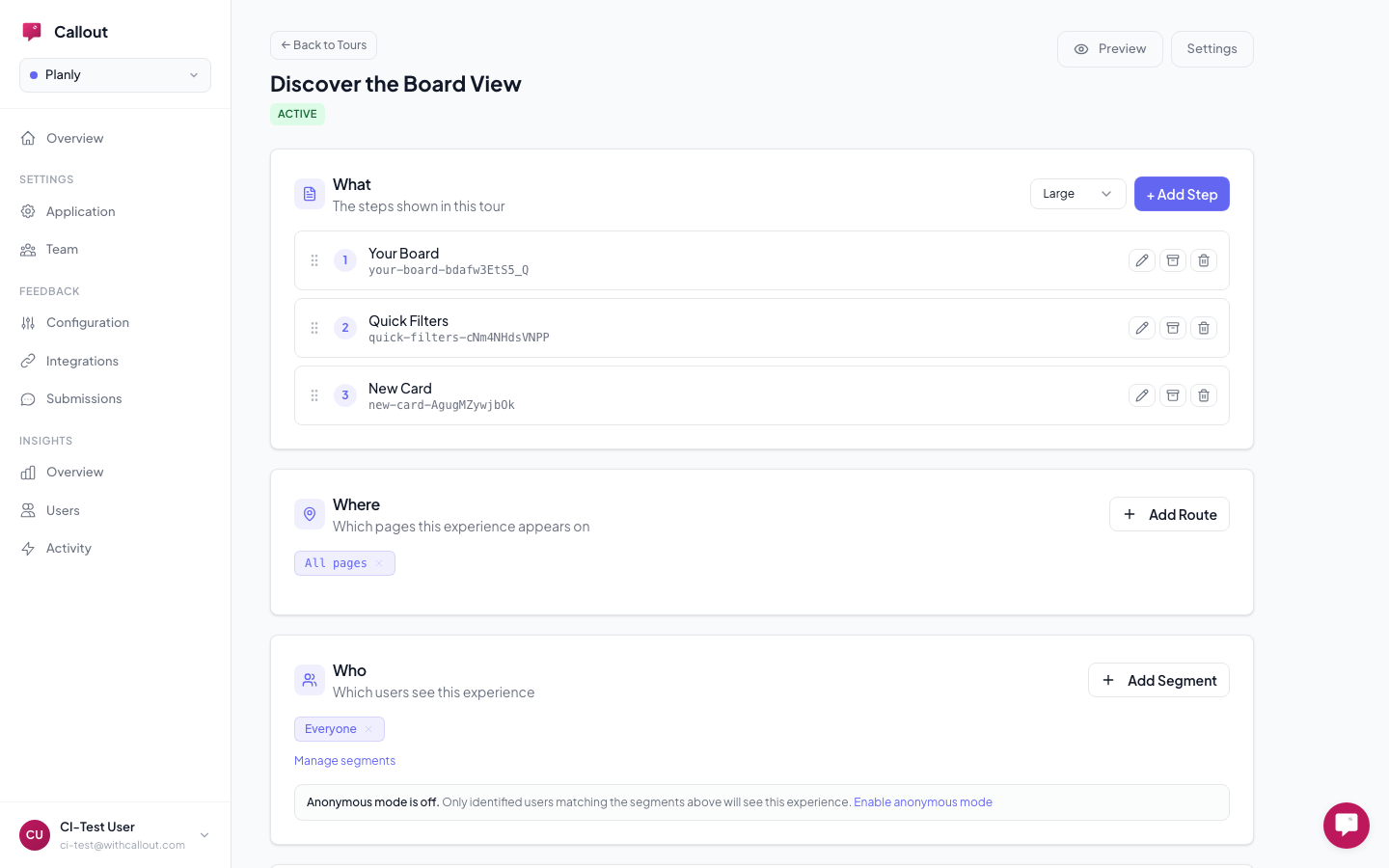
Go to Engage > Experiences > Tours in your dashboard and create a new tour.
Tour Settings
- Title — internal name for your team (shown in analytics, not to users)
- Description — optional internal notes
- Size — controls the popover width:
- Small (320px) — quick feature highlights, short explanations
- Large (520px) — detailed walkthroughs, steps with images or longer text
- Target Pages — URL patterns that control where the tour appears (e.g.,
/dashboard/*) - Segments — which user segments see this tour
Building Steps
Each step in a tour has:
- Title — the heading your users see
- Body — the explanation text
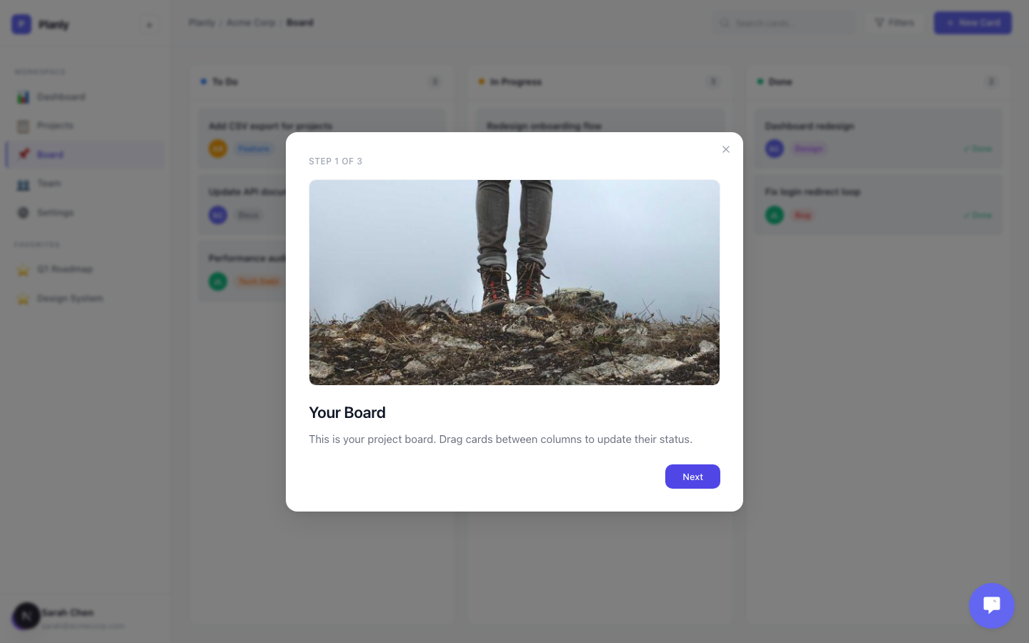
- Image (optional) — upload a screenshot or GIF to show what you're describing
- CSS Selector — points to the element on the page to highlight
You can drag to reorder steps, archive steps you no longer need (without deleting them permanently), and preview the full flow before publishing.
Choosing Good Selectors
Each step anchors to a UI element using a CSS selector. Use stable selectors that won't break when your UI changes:
{/* Good — stable */}
<button id="create-project-btn">New Project</button>

{/* Good — stable */}
<button data-callout="export">Export</button>
Use id or data-* attributes. Class names break when styles change. If the target element doesn't exist on the page, the tour won't start.
What Your Users See
When a tour is active, users see a focused popover anchored to the highlighted element:
- Title and description explaining the feature
- Image (if you added one) shown above the text
- Next / Back buttons to navigate between steps
- Step indicator showing progress (e.g., "2 of 5")
- Dismiss button (X) to close the tour at any time
- On the final step, "Next" changes to "Done"
After the Tour
Callout tracks three outcomes for each user:
- Completed — the user went through all steps and clicked Done. The tour won't show again.
- Dismissed — the user closed the tour before finishing. The tour won't show again.
- Bounced — the user navigated away while the tour was active. The tour may show again on their next qualifying visit.
You can see completion rates and drop-off data at Insights > Overview.
Best Practices
- Keep tours short — 3 to 5 steps. Longer tours have much higher drop-off.
- Add images to complex steps — a screenshot or GIF of the action you're describing makes it click.
- Test on different screen sizes — popovers reposition automatically, but verify your target elements are visible.
- Use descriptive titles — "Click here to create a project" is better than "Step 1."
- Archive old steps instead of deleting them — you can always bring them back.
Tours require an identified user to track completion. Anonymous users won't see tours — use tooltips or banners for anonymous guidance.