Tooltips & Banners
Lightweight contextual guidance and page-wide announcements.
Not everything needs a full tour. Tooltips point at a specific element and explain it. Banners announce something to everyone on the page. Both are managed from your dashboard — no code needed.
Tooltips
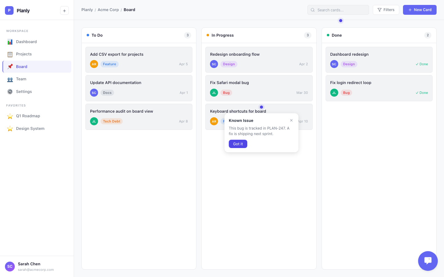
A tooltip is a small popover next to a button, link, or any element on your page. Use it to explain a feature, highlight something new, or nudge a user toward an action.
Creating a Tooltip
Go to Engage > Experiences > Tooltips and create a new tooltip:
- Title — the heading text
- Body — a short explanation (1-2 sentences works best)
- Selector — the CSS selector of the element it points to (e.g.,
#settings-btnor[data-callout="export"]) - Position — where the popover appears relative to the element: top, bottom, left, or right
- Target Pages — URL patterns to control which pages it appears on
- Segments — which user segments see it (or leave on "Everyone")
If the tooltip would overflow the viewport, it repositions automatically.
Dismissal
Users dismiss a tooltip by clicking the X button. For identified users, dismissal is permanent — the tooltip won't come back. For anonymous users, dismissal lasts for the browser session.
Don't show more than 2-3 tooltips on one page. If you need multi-step guidance, use a product tour instead.
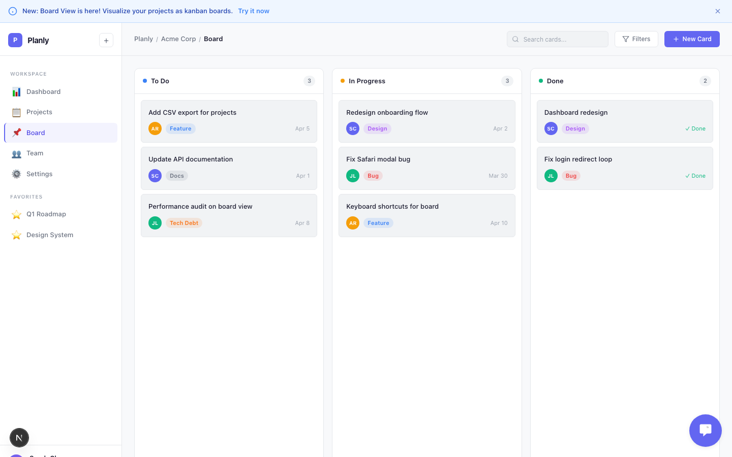
Banners
A banner is a page-wide message — more prominent than a tooltip. Use it for feature announcements, maintenance notices, upgrade prompts, or success confirmations.
Creating a Banner
Go to Engage > Experiences > Banners and create a new banner:
- Message — the text your users see
- Type — controls the visual style:
- Info (blue) — new features, tips, announcements
- Warning (amber) — upcoming changes, maintenance notices
- Success (green) — completed actions, positive confirmations
- Error (red) — critical issues, required actions
- Position — where it appears:
- Top — fixed to the top of the viewport
- Bottom — fixed to the bottom
- Inline — appears between your header and your page content
- CTA Button (optional) — add a call-to-action with custom text and a link (e.g., "Enable Dark Mode" →
/settings/appearance) - Dismissible — whether users can close the banner. Non-dismissible banners stay visible until you deactivate them.
- Target Pages — URL patterns to control which pages it appears on
- Segments — which user segments see it
Specific CTAs convert better than generic ones. "Enable Dark Mode" outperforms "Learn More."
Targeting
Both tooltips and banners support two kinds of targeting:
- By page — set URL patterns so a tooltip only shows on the settings page, or a banner only shows on the dashboard
- By user — assign segments to show experiences to specific audiences (e.g., free-plan users only)
Tooltips and banners also work for anonymous users when targeted by URL — unlike tours and checklists, which need an identified user.